You can choose the right living room colors for dark Canadian winters by focusing on warm neutrals with higher light reflectance values, selecting full spectrum paint that stays vibrant in low light, and embracing the 2026 “drenching” trend to create a rich, cozy atmosphere during the long winter season. These strategies help your home feel warm and inviting even when outdoor light is at its lowest, a challenge highlighted in Statistics Canada’s research on reduced winter daylight and its impact on mood.
For many Canadians, the biggest design challenge from November to March is not temperature but light quality. The wrong paint can make a living room feel flat and chilly, while the right one can turn the space into a comfortable retreat.
Understanding Light and How It Affects Paint
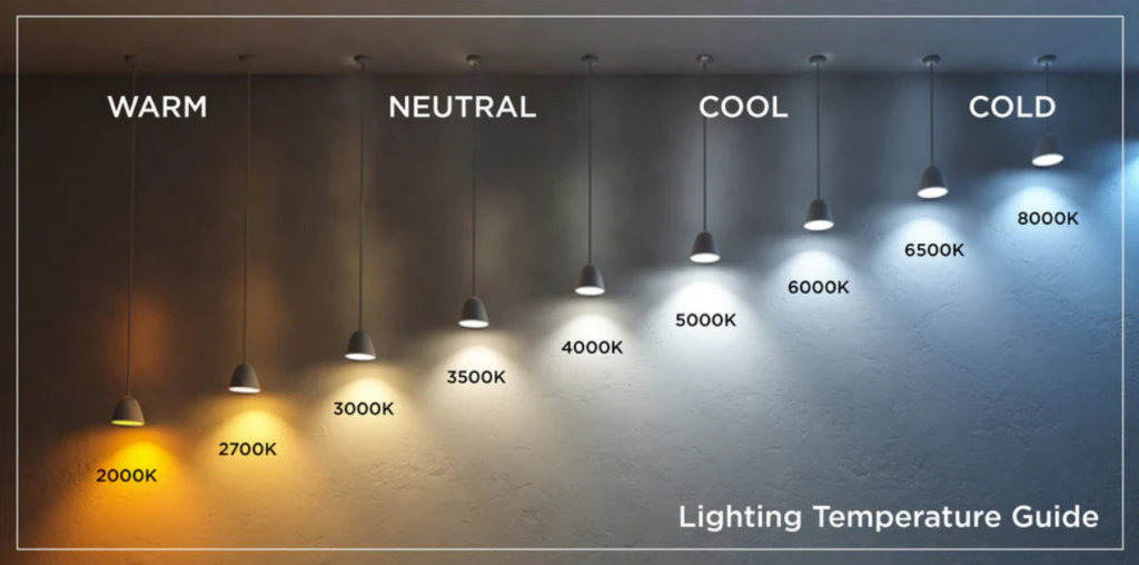
Choosing winter-friendly colors starts with understanding how northern light behaves. In winter, sunlight arrives at a low angle and contains more blue tones than in summer. This cooler light can dramatically shift how color appears indoors.
- Why white struggles: True whites rely on abundant sunlight to look crisp. Under dim, blue-tinted winter light, they often turn gray or dull.
- Warm undertones to the rescue: Colors with gentle red, yellow, or peach undertones help counteract that cool cast, making the space feel more balanced.
- Aim for mid-range reflectivity: An LRV of around 60 to 75 brightens a room without washing it out, as defined by the Light Reflectance Value standard. It is the sweet spot for living areas that need to stay warm while still feeling open.
How Smart Color Choices Affect Comfort and Value
The right palette does more than shift the mood of a room. It can impact resale appeal and even how you feel on gloomy days.
- Better daily experience: Warm neutrals act like passive mood boosters, softening the psychological impact of long, dark winters, which aligns with university research on how reduced winter light affects mood and wellbeing.
- Luxury perception: High-end homes rarely rely on flat, bright whites. They use layered tones that shift subtly throughout the day. Full spectrum paints are especially effective in Canada because they avoid the murkiness that appears in low natural light.
- Stronger resale value: Buyers often describe warm rooms as larger, even when dimensions are unchanged. A well-chosen palette makes a home feel lived-in and welcoming.
Two Ways to Approach Winter Color: Brighten or Embrace the Dark
You can either fight against the winter light or work with it. Both approaches work when applied intentionally.
| Parameter | Strategy A: The “Reflector” (Lighten Up) | Strategy B: The “Cocoon” (Hunker Down) |
| Goal | Maximize every photon of light to make the room feel airy. | Embrace the shadows to create a moody, speakeasy vibe. |
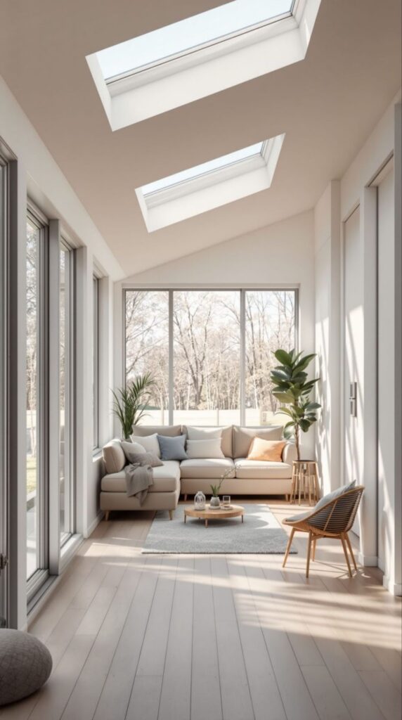
| Best For | South or West-facing rooms that get some sun. | North-facing rooms that never get direct sun. |
| Color Palette | Warm Whites & Creams. | Deep Earth Tones. |
| The Risk | Can look “sterile” if you use a cool white. | Needs strong layered lighting to avoid feeling heavy. |
Choosing the Right Colors for 2026
Warm, grounded neutrals continue to lead Canadian design trends, especially in colder regions.
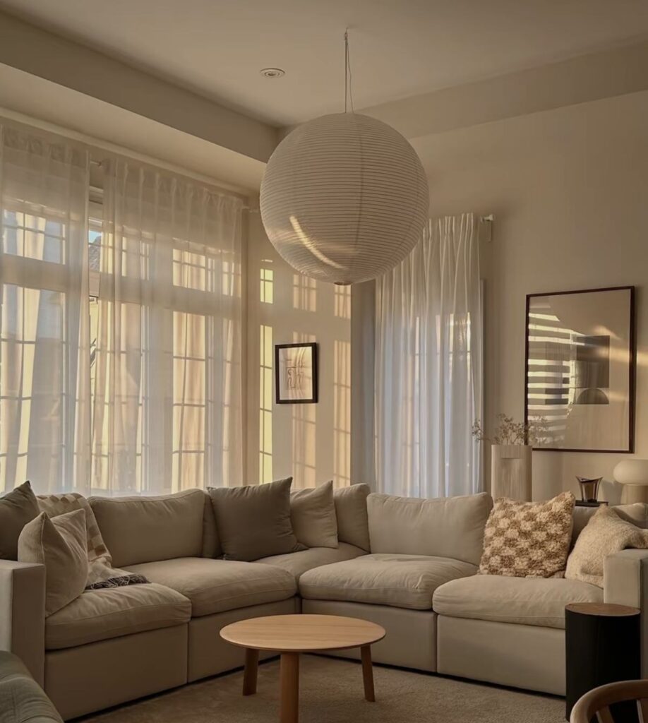
- Modern neutrals: Mushroom, greige, and soft stone tones balance well with both warm and cool furniture. Colors like Pale Oak or Accessible Beige offer warmth without feeling dated.
- Upgrading to full spectrum: In dim corners or hallways, full spectrum formulas help prevent colors from going muddy. They keep depth and dimension throughout the day.
- Finishes that brighten: Choosing eggshell or satin adds a subtle sheen that helps bounce light through the room, improving clarity and glow.
Mistakes to Avoid When Choosing Living Room Colors
- Sampling incorrectly: Testing colors on small white cards gives misleading results. Apply large swatches directly to the wall and review them in late afternoon light for the most accurate read.
- Ignoring existing materials: Many Canadian homes still have warm-toned oak floors. Gray walls amplify the orange in those floors. Warm neutrals complement them far better.
- Using harsh bulbs: Even the perfect color can fall flat under blue-toned lighting, as explained by professional lighting research from the Illuminating Engineering Society. Choosing warm 3000K bulbs is essential to make paint look intentional and upscale.
A Closer Look at Colour Drenching
Colour drenching continues to gain momentum for winter-focused design. Painting the walls, trim, and ceiling in the same color removes visual breaks and makes the room feel larger and more cohesive.
In darker rooms, this technique turns shadows into a design feature. Instead of fighting uneven lighting, you create an enveloping, tailored feel that supports relaxation during the colder months.
FAQ
1. How do I choose a color that still looks warm once winter light turns everything cooler and grayer?
Start by checking how the room looks in late afternoon light. Northern light can drain color, so warm undertones are essential to keep the space feeling inviting when daylight is at its weakest, a challenge homeowners frequently discuss in real examples like this Reddit thread on cold north-facing rooms.
2. What should I pay attention to if my home already has warm-toned wood floors or trim?
Work with the undertones, not against them. Warm neutrals and soft beiges balance the natural warmth of oak or maple, while cool grays can highlight orange tones and create an unintended clash.
3. How can I confidently use darker colors without making the room feel closed in?
Pair deeper hues with layered lighting and a few lighter furnishings. This creates a cozy, cocoon-like atmosphere that feels intentional during long winter evenings.
4. How do I pick the right white for a room that barely gets any sun in winter?
Lean toward creamy off-whites with subtle warmth. Bright whites tend to look flat or icy in low northern light, while warmer whites stay soft, calm, and welcoming all winter long.
Conclusion
Choosing the right living room colors for dark Canadian winters means understanding how northern light behaves and selecting tones that work with, not against, our climate. Warm neutrals, full spectrum paints, and the right sheen can transform a dim room into a rich and inviting space. When paired with updated lighting, these small changes create a major shift in how your home feels during the darkest months of the year.